
Visual Thinking: How to Tell a Story About the Climate Crisis
Author and Editor: Mariam Kvaratskhelia
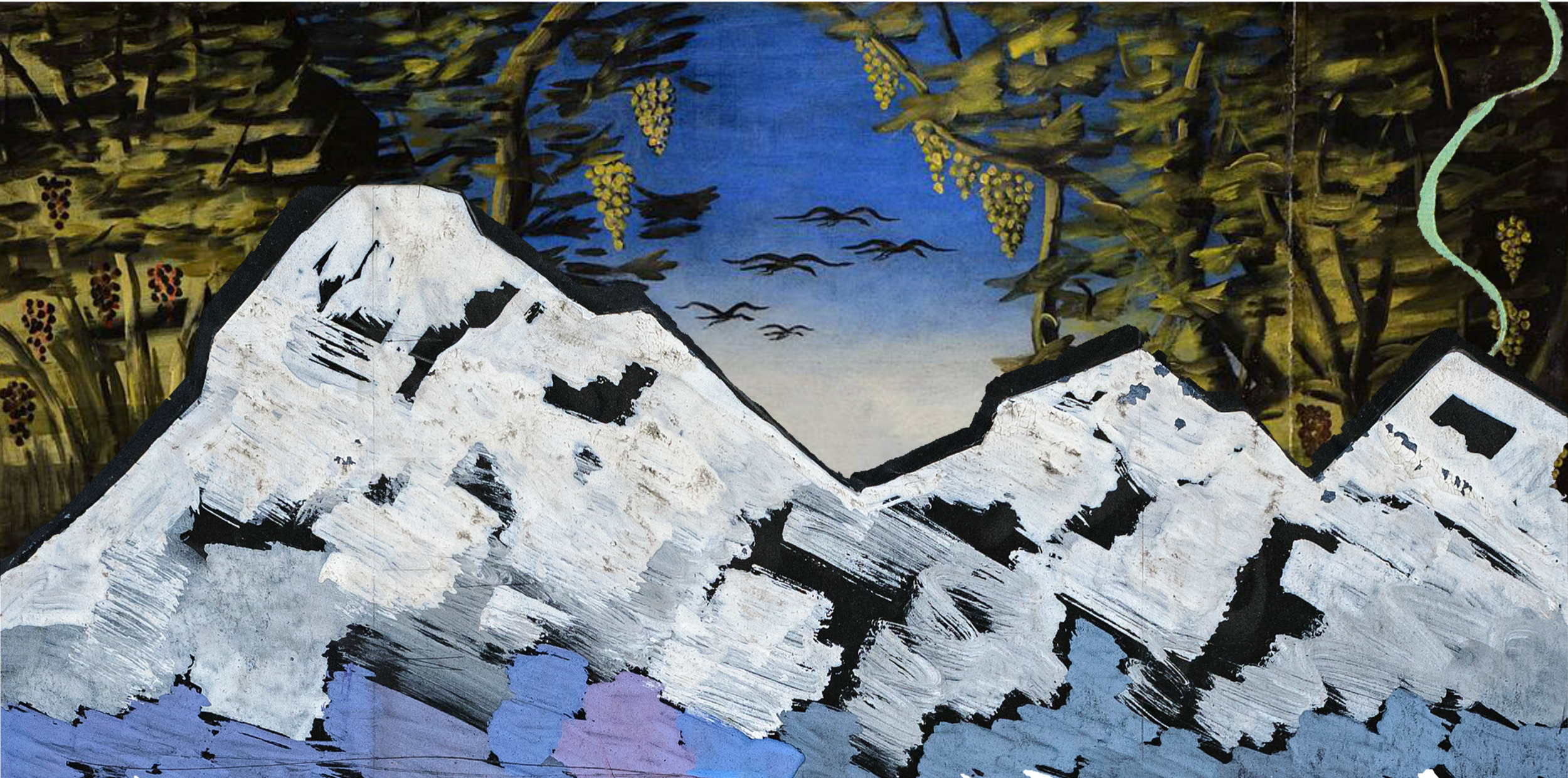
Illustration by Mariam Kvaratskhelia (incorporates works of David Kakabadze and Niko Pirosmani)
We have all heard stories about reports or documents that required significant resources to produce, yet ended up “collecting dust on a shelf” without ever truly being read or understood.
Although we live in an information age where large amounts of important knowledge are constantly being created and shared, much of it still fails to reach the wider public. This may be caused by a lack of public interest, but also by ineffective communication methods that often overlook visual storytelling and art.
First of all, we should admit that climate data visualization, and data visualization in general, is often boring and difficult to understand. This makes it even harder to communicate climate issues to broad audiences.

Our brain when seeing a complicated graph
The Scream, Edvard Munch
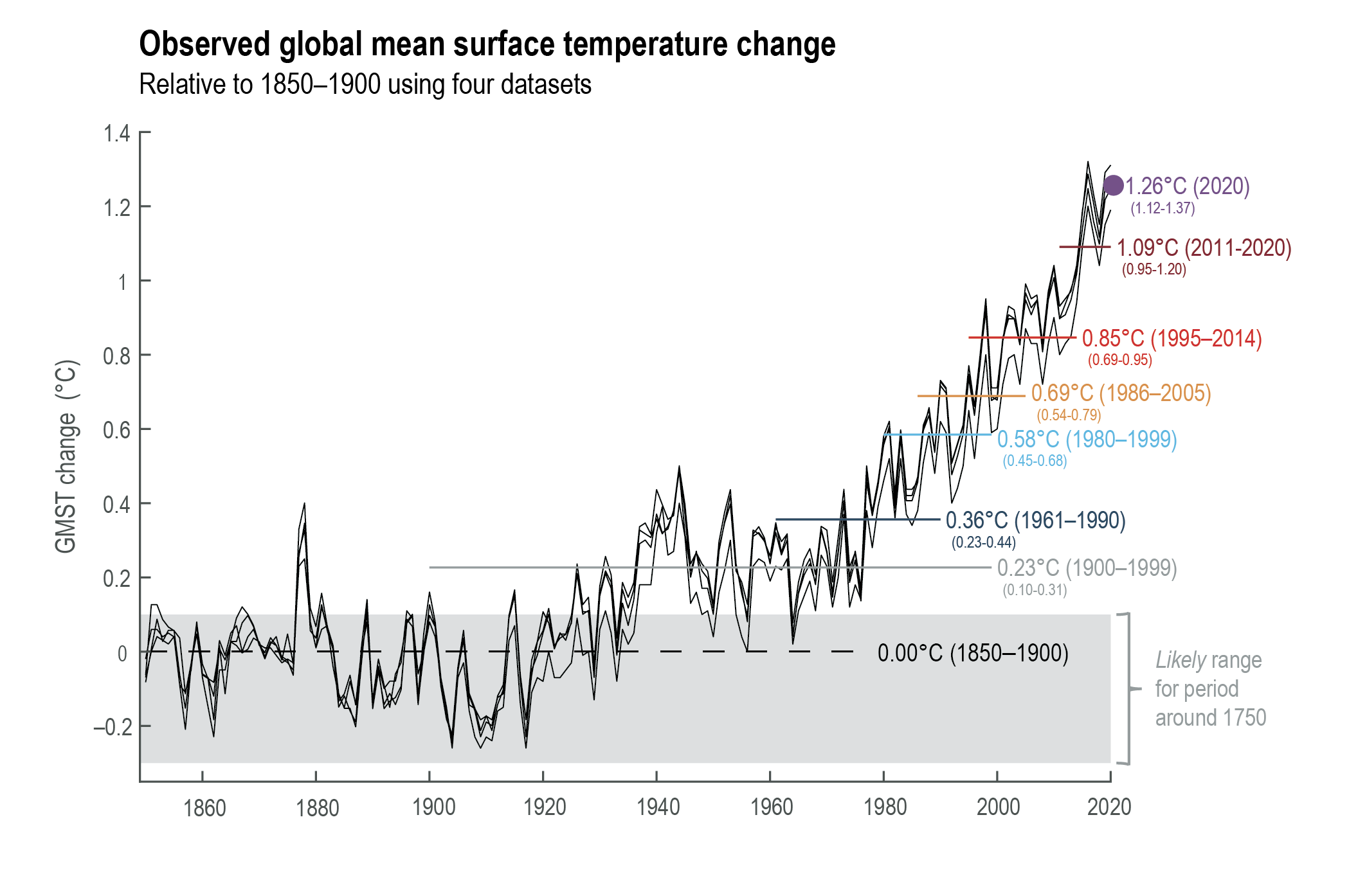
To illustrate this, let us look at two examples. The first image is a graph taken from the Sixth Assessment Report of the Intergovernmental Panel on Climate Change (IPCC) [2]. It contains extremely important scientific information that forms the basis of discussions around rising global temperatures. However, for a human brain naturally inclined toward visual thinking [3], such graphs can feel not only difficult to understand, but also emotionally distant.
On the other hand, the visualization created by Ed Hawkins, based on the exact same data, is far more adapted to the way the human mind processes information. Through carefully selected colors, the illustration clearly communicates temperature changes while also triggering a subconscious sense of alarm through the use of red tones.

Interestingly, this raises a question: how did a society that evolved through visual thinking become so disconnected from visual methods of communication?
To answer this, we should go far back in time: to a period when humans had not yet developed spoken language and relied mainly on images to communicate. Cave paintings, carved symbols, and hunting scenes drawn on rocks and cave walls are among the earliest examples of visual storytelling. Through these images, early humans shared knowledge, experiences, and important information with one another.
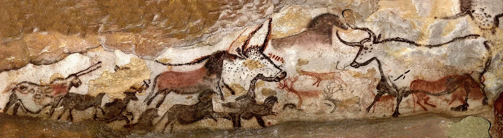
Lascaux Cave, France
Centuries later, Aristotle also emphasized the importance of visual thinking in both the conscious and subconscious mind. In De Anima (On the Soul), he describes imagination as a separate human ability connected to thought and perception. Aristotle believed that humans think through images, famously writing that “whenever one contemplates, one necessarily at the same time contemplates in images” (De Anima, III.8) [1]. He further develops these ideas in works such as De Memoria (On Memory) and De Insomniis (On Dreams), where he explores the relationship between images, memory, dreams, and understanding [5].

The School of Athens, Raphael
Aristotle’s ideas were later reinforced by research [4] conducted at the Massachusetts Institute of Technology, which showed that the human brain processes images extremely quickly. In a 2014 study led by neuroscientist Mary Potter, researchers found that the brain could identify images shown for as little as 13 milliseconds. The study demonstrated that people are capable of understanding visual meaning almost instantly, even when images appear in rapid sequences. According to Potter, this suggests that the brain is constantly searching for concepts and meaning through visual information [6].
These findings support the idea that visual communication is highly effective because the human brain processes images faster and more directly than large amounts of written text.
As a result, prehistoric art, philosophy, neuroscience, and many other examples all point toward the same conclusion: there is no need to reinvent the wheel. Humans naturally think through images, and this fact should shape the methods and strategies used to communicate information effectively.
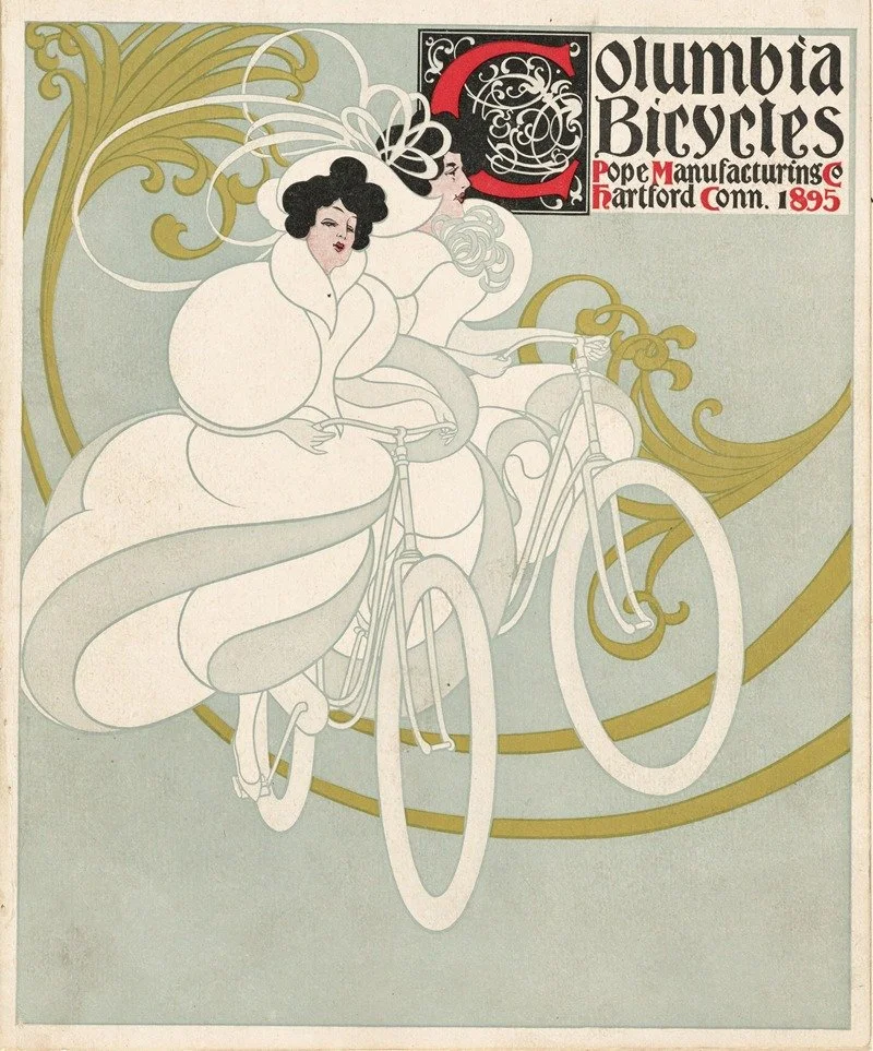
Columbia Bicycles
1895, Will Bradley
In the field of climate communication specifically, it is also important to carefully choose the verbal messages that accompany visual concepts. Psychology offers a useful concept known as “Compassion Fade,” which describes how human empathy often decreases as the scale of tragedy grows larger [7]. Because of this, climate communication should remain locally grounded and emotionally relatable.
For example, the slogan “Save the Earth” is so broad that it rarely creates a strong emotional response. However, a message such as “Protect Ushguli from natural disasters” feels much more personal, specific, and emotionally engaging.
Save Ushguli from natural disasters
〰️
Save Ushguli from natural disasters 〰️
While visual communication should remain focused on the central issue, it is equally important to include familiar cultural elements capable of creating emotional connections and associations. Such elements can often be found in local culture, landscapes, art, music, literature, and cuisine.
In Georgia’s case, cuisine became one such cultural element through which four major climate issues were communicated visually: glacier melting, deforestation, rising temperatures, and desertification.

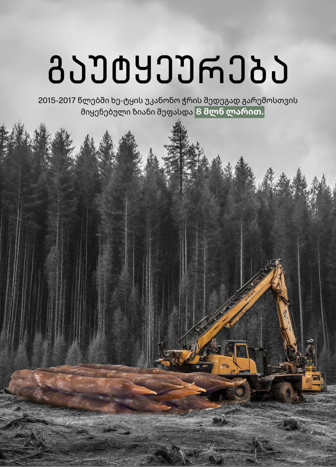


Illustrations by Mariam Kvaratskhelia
Art can also function as a cultural bridge.
In Georgia, the works of Niko Pirosmani and David Kakabadze carry strong emotional and cultural associations that are instantly recognizable to local audiences.
Illustrations by Mariam Kvaratskhelia
Additionally, combining different textures and visual styles, such as photography and illustration can intensify emotional impact and deepen visual associations.
Illustrations by Mariam Kvaratskhelia
Ultimately, with the right approach and perspective, it is entirely possible to visualize complex scientific information, such as climate data, and communicate it effectively to broad audiences. The key lies in understanding human psychology and cognition, and in using visual elements strategically.
Aristotle. (n.d.). De anima (On the soul).
Intergovernmental Panel on Climate Change. (2021). Climate change 2021: The physical science basis. Contribution of Working Group I to the Sixth Assessment Report of the Intergovernmental Panel on Climate Change. Cambridge University Press. https://www.ipcc.ch/report/ar6/wg1/
Jarrett, C. (2017, May 18). Visual images often intrude on verbal thinking, study says. Harvard Gazette. https://news.harvard.edu/gazette/story/2017/05/visual-images-often-intrude-on-verbal-thinking-study-says/
Potter, M. C., Wyble, B., Hagmann, C. E., & McCourt, E. S. (2014). Detecting meaning in RSVP at 13 ms per picture. Attention, Perception, & Psychophysics, 76(2), 270–279. https://doi.org/10.3758/s13414-013-0605-z
Shields, C. (2020). Imagination. In The Stanford Encyclopedia of Philosophy (Supplement to Aristotle’s Psychology). Stanford University. https://plato.stanford.edu/entries/aristotle-psychology/suppl4.html
Trafton, A. (2014, January 16). In the blink of an eye. MIT News. https://news.mit.edu/2014/in-the-blink-of-an-eye-0116
Västfjäll, D., Slovic, P., Mayorga, M., & Peters, E. (2014). Compassion fade: Affect and charity are greatest for a single child in need. PLOS ONE, 9(6), e100115. https://pmc.ncbi.nlm.nih.gov/articles/PMC4062481/